Intro
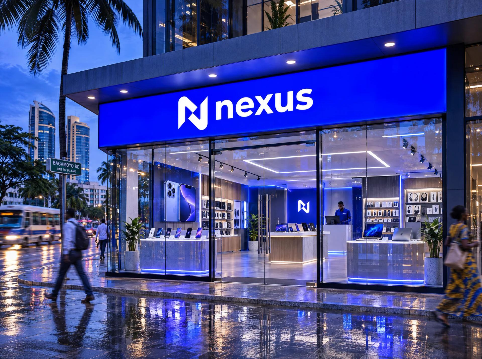
An identity for an electronics retailer built on one idea: the place where things connect.
Deliverables:
- Logo●
- Brand system●
Timeline
- ResearchWk 1Store visits and competitor audit across Dar es Salaam electronics streets.
- ConceptsWk 2Monogram directions built around 'central point' and 'forward motion'.
- RefinementWk 3Construction grid, wordmark and the three-colour palette.
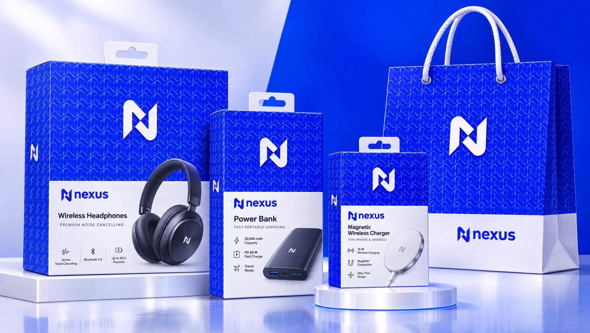
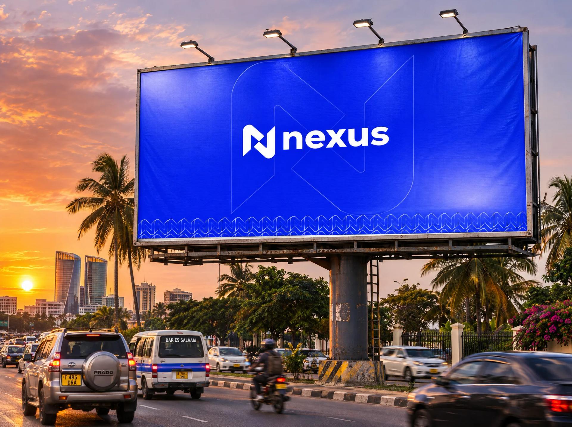
- SystemWk 4Repeat pattern and key applications: signage, packaging, bags.
The problem
Electronics shops all look the same: the same posters, the same phone brands. Nexus needed to be recognised from the street and remembered after the customer walks out.
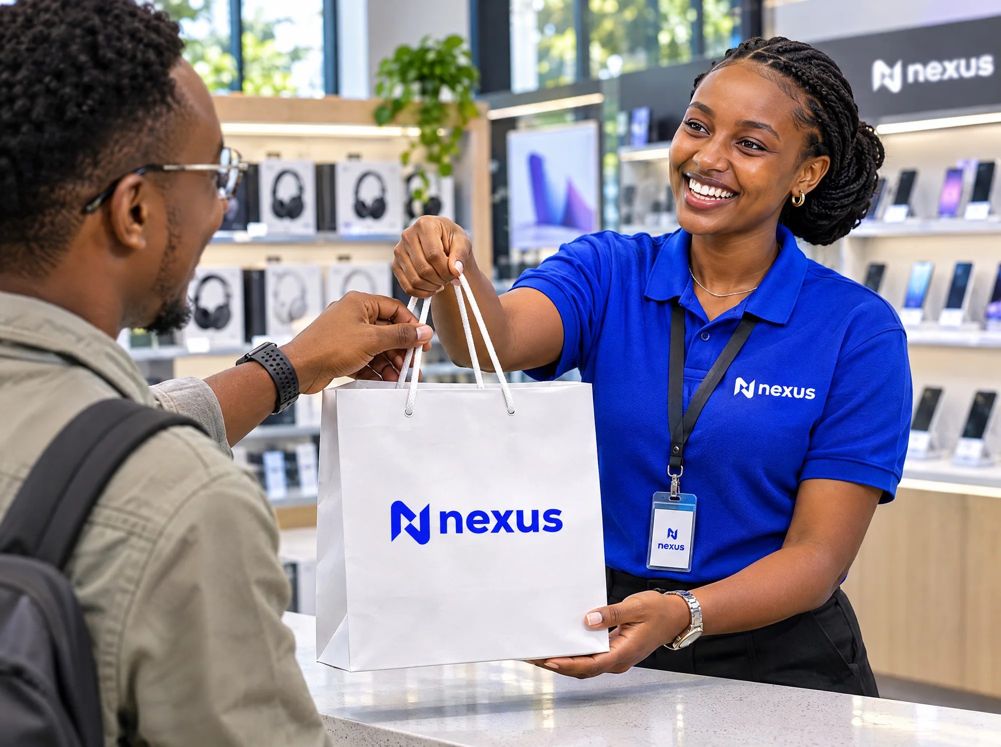
In electronics retail, customers remember the product brand, not the shop, so they buy wherever is cheapest next time. To keep customers coming back, Nexus needed its own identity on every surface the customer takes home (bags, boxes, receipts) and a storefront that stands out on a crowded street, without fighting the big manufacturer logos on the shelves.
The solution
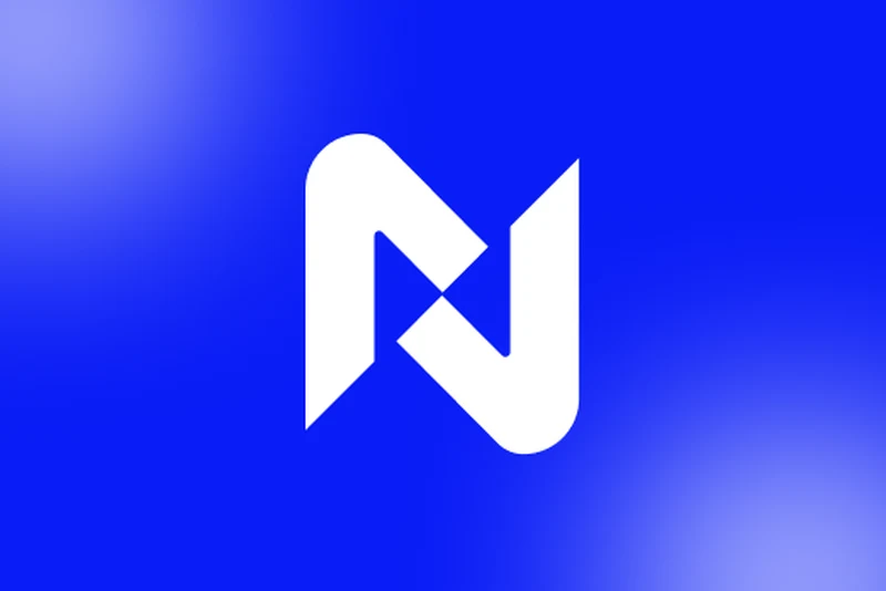
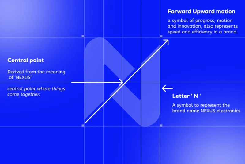
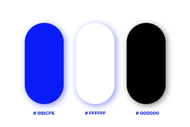
The N monogram is built around a central point where its strokes meet, the literal meaning of 'nexus', with a diagonal that moves forward and up to suggest progress and speed. Electric blue (#091CF6), white and black are the only colours, so the brand reads instantly next to busy product packaging. A repeat pattern made from the monogram turns bags, boxes and backdrops into brand surfaces without needing the full logo each time, and the rounded lowercase wordmark keeps it approachable rather than corporate.
Highlights
3
colours: blue #091CF6, white, black

Next work
Pesalock