Timeline
- DiscoveryWk 1Rode along the booking process with customers and riders; listed every reason people call.
- LogoWk 2-3Rounded 'pak.' wordmark and three colour variants.
- UX flowsWk 3-5Booking, receiver, payment and tracking flows with phone-first sign up.
- UI designWk 5-821 screens in a fresh green system, handed over with specs.
The problem
Sending a parcel across Dar es Salaam means calling a rider, haggling over the price and calling again to ask where it is. PAK had to replace those calls with an app people trust on the first try.
Every unknown in a delivery costs money. Customers abandon a booking when the price isn't clear, riders lose time answering 'where are you?' calls, and wrong receiver details cause failed drops that have to be paid for twice. The app had to make the price, the parcel's location and the receiver unmistakable, and work for people who sign up with a phone number rather than an email.
The solution
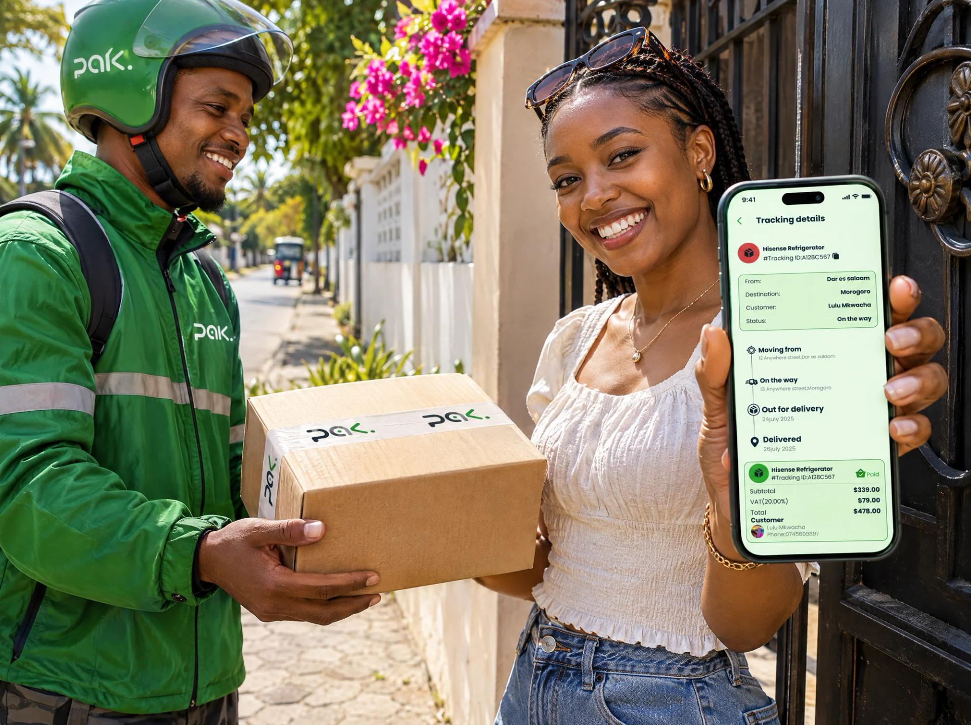
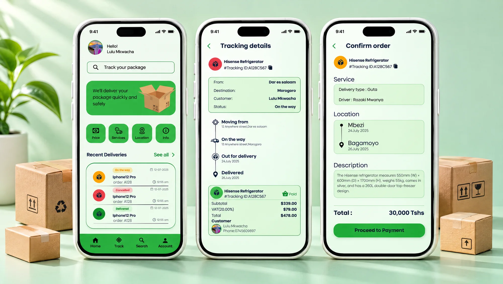
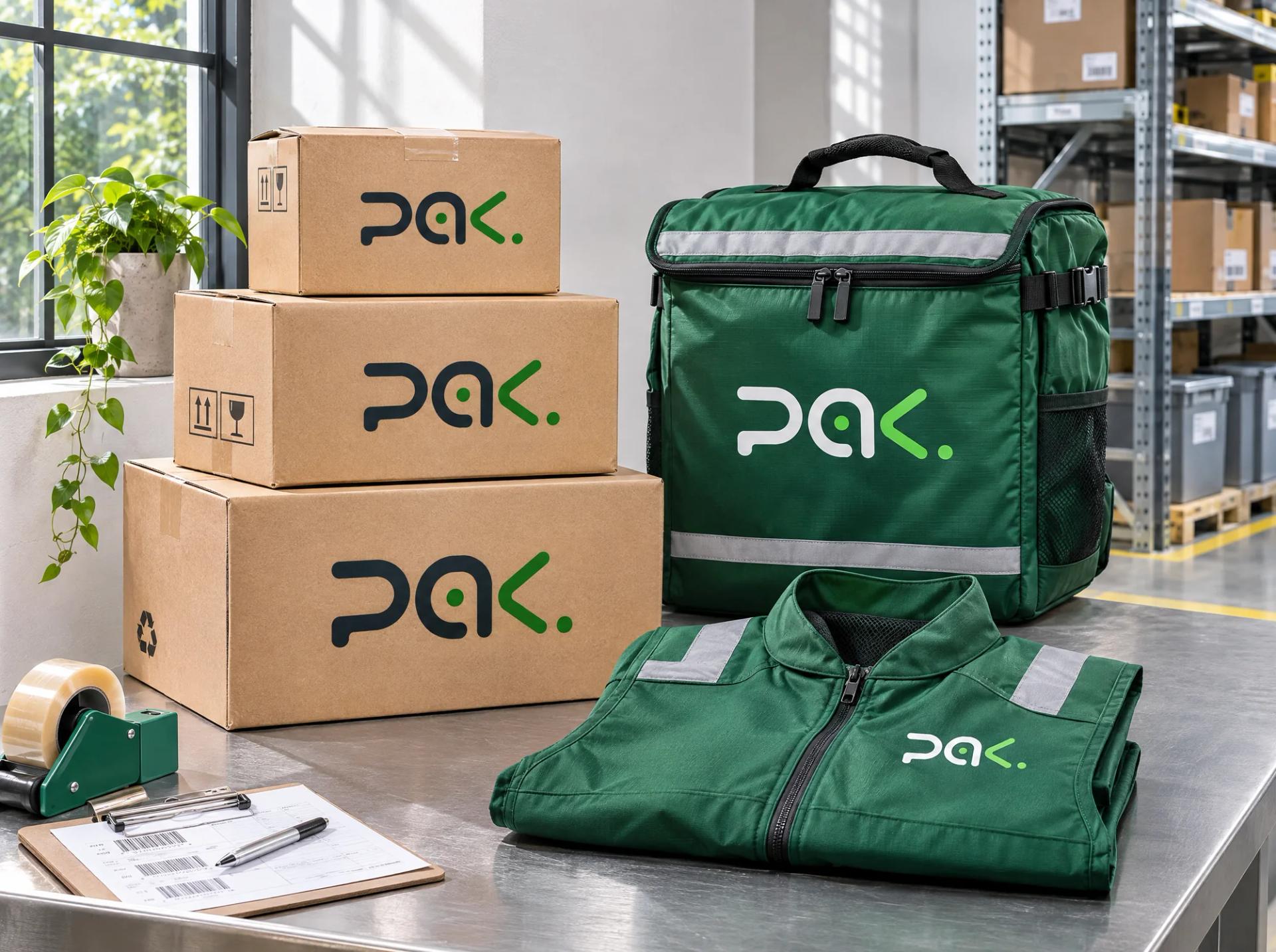
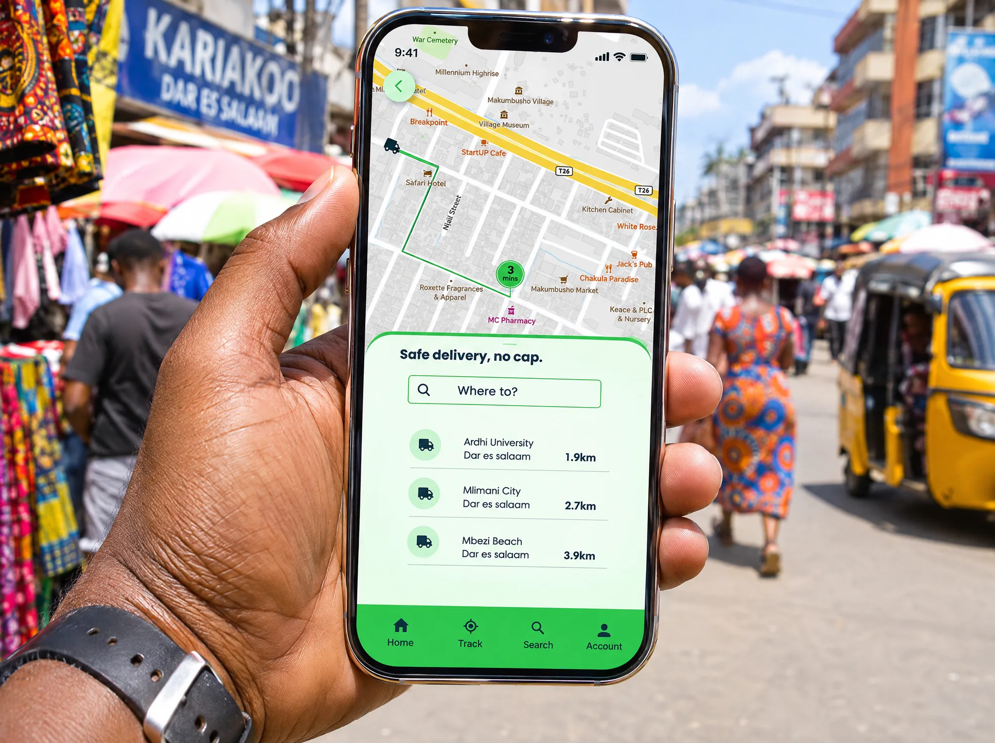
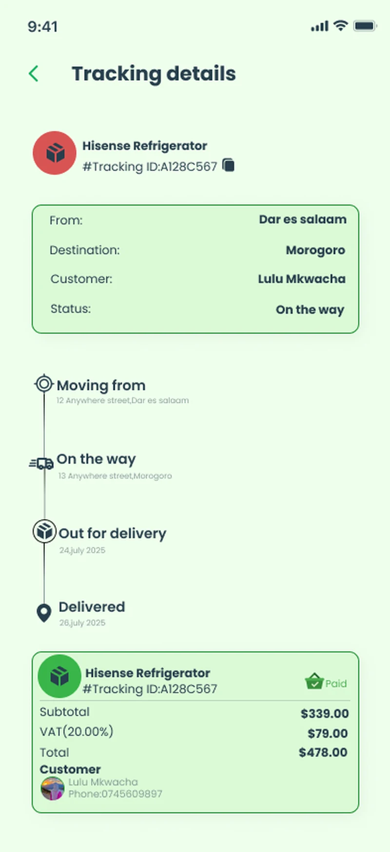
Booking starts with four package sizes (under 1 kg up to over 20 kg), so the price is known before the customer commits. Receivers can be saved, so the details are typed once and stay right. The order confirmation shows driver, route and total in TZS on one screen. Tracking reads like a journey (moving from, on the way, out for delivery, delivered) instead of a status code, which removes most reasons to call. History uses colour for on the way, delivered and cancelled, and password recovery works by phone or email. The 'pak.' wordmark uses rounded letters and a green dot that reads as 'arrived', in light, dark and tinted versions for app icons, parcels and rider gear.
Highlights
21
screens designed
4
package sizes, priced before you book
Next work

Marine Adventures