Timeline
- DiscoveryWk 1-2Talked to venue managers and regular goers; defined what each side needs to see to come back.
- Flows & IAWk 2-4Two apps in one: visitor journey and venue manager journey, mapped end to end.
- UI designWk 4-935 screens in a dark, night-friendly system with one orange accent.
- Prototype & testWk 9-10Clickable prototype tested with visitors and venue owners; refined onboarding and booking.
The problem
Venues pay for Instagram posts that disappear in a day, while people still pick their night out from WhatsApp forwards. Fyspo had to become the first place both sides check.
Fyspo is a two-sided product, and it only earns money if both sides show up. Going-out audiences face stale information and too many choices, so they default to the same three places. Venue owners have no proof that their promotion works and no direct way to sell tickets. The design had to make browsing feel effortless for visitors and make the value obvious to venues fast enough that they list, keep listing and eventually pay.
The solution
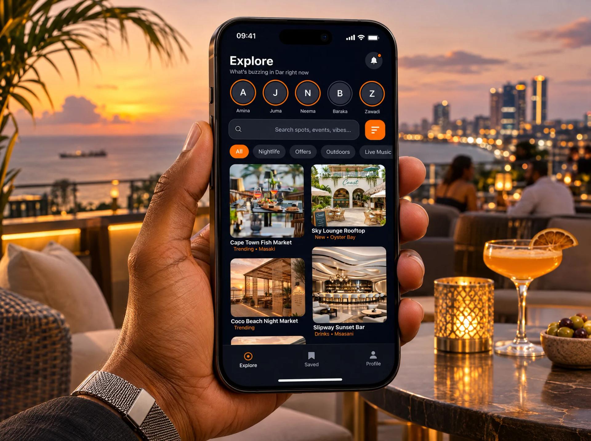
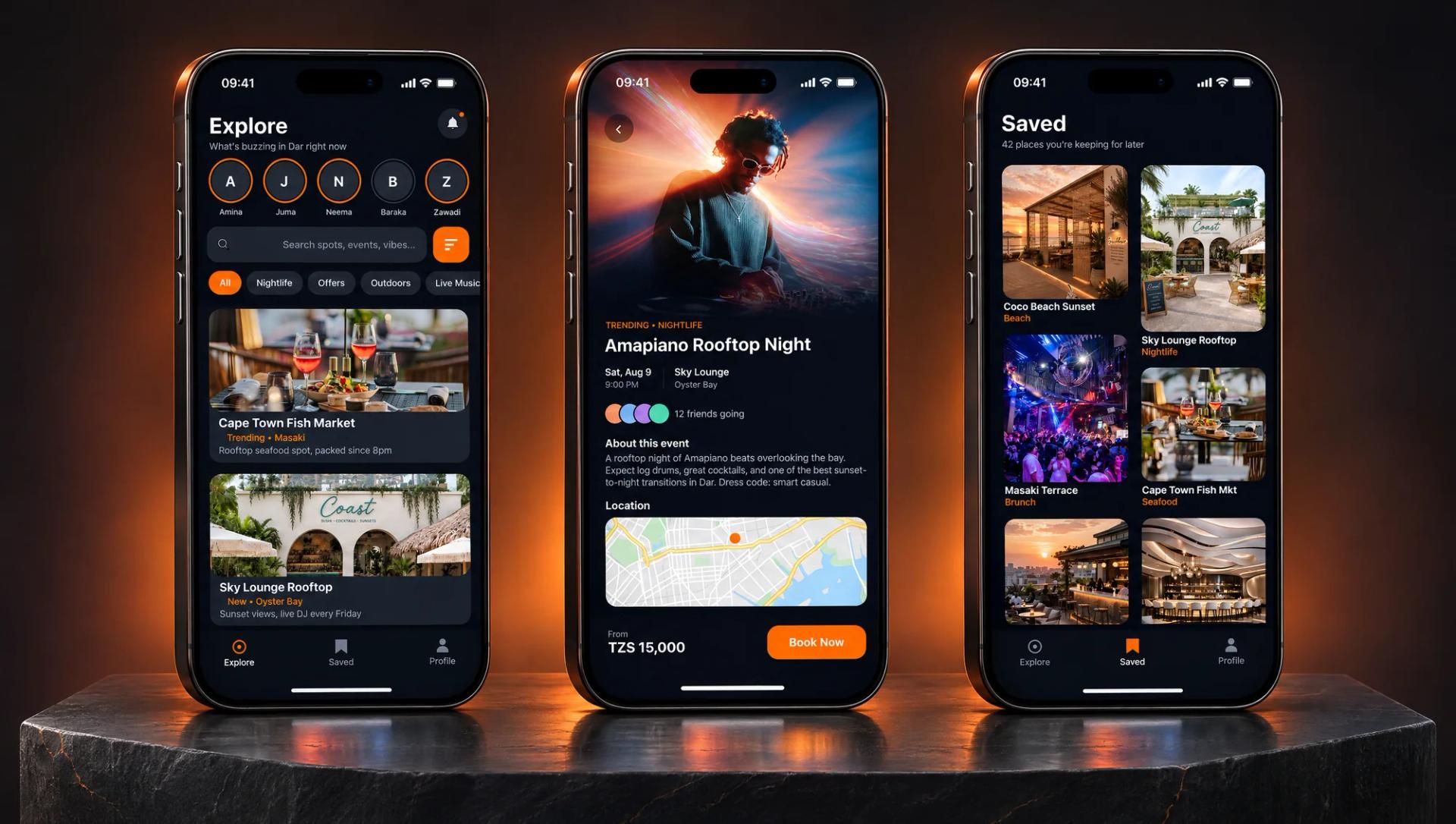
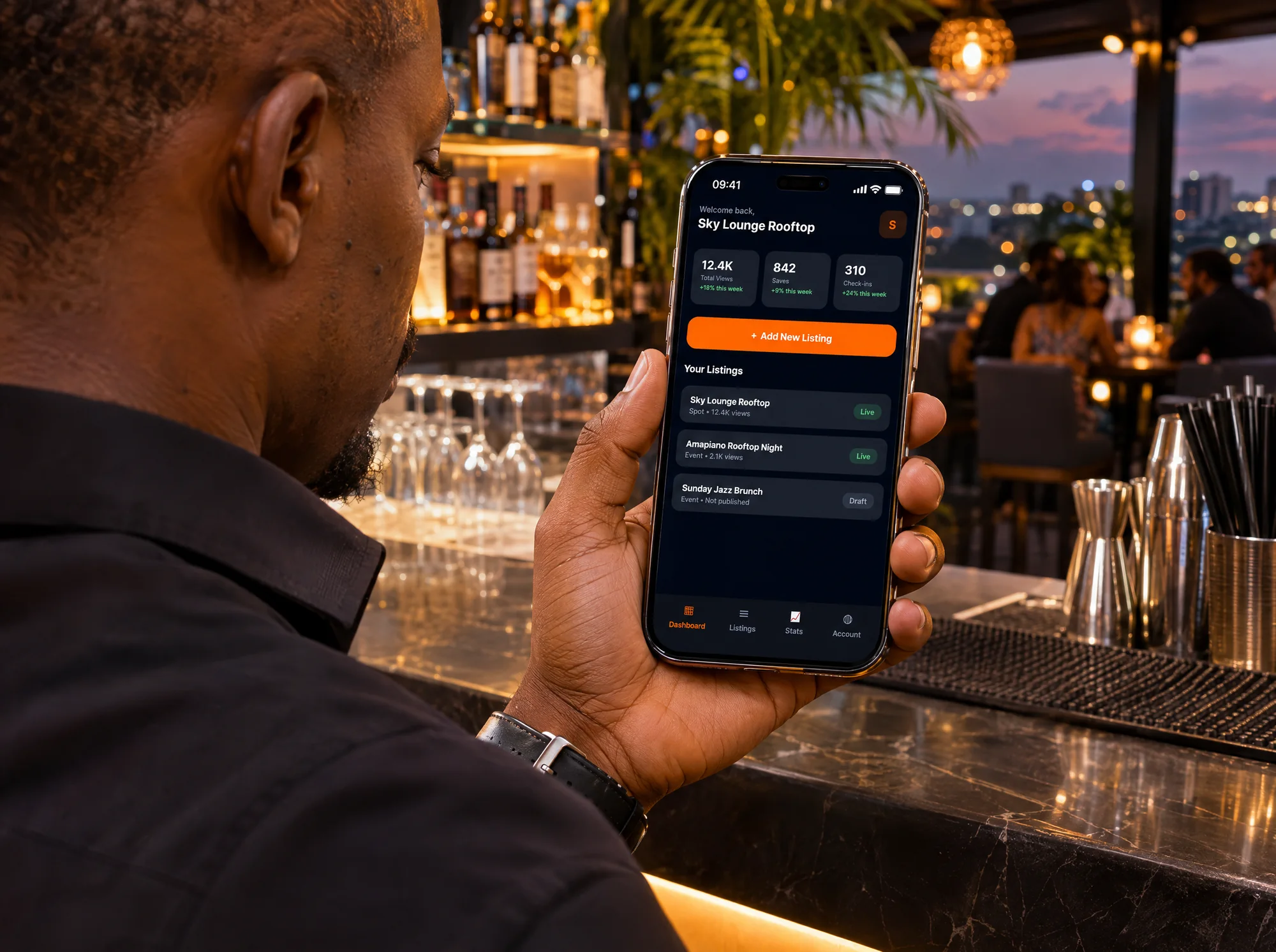
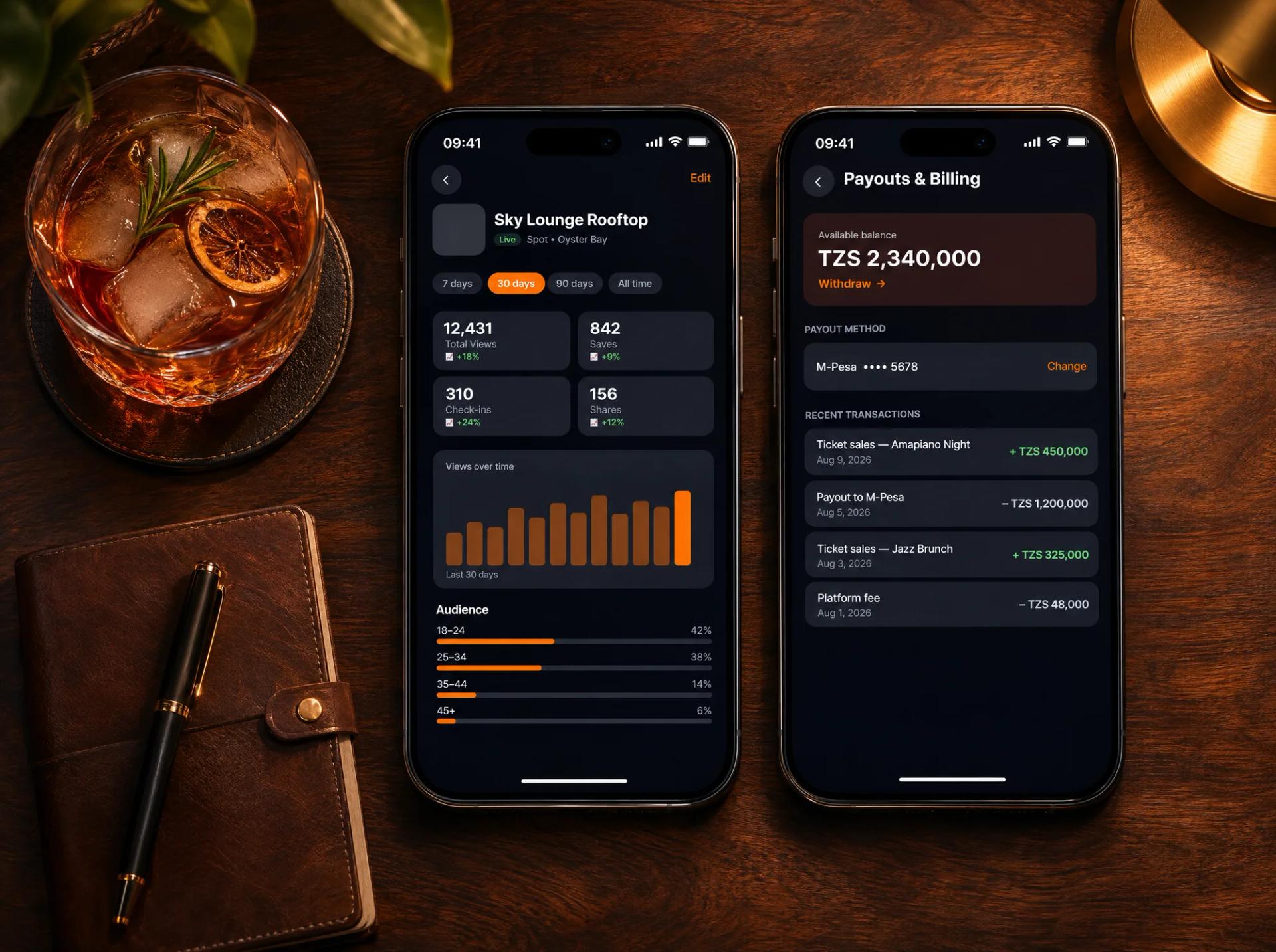
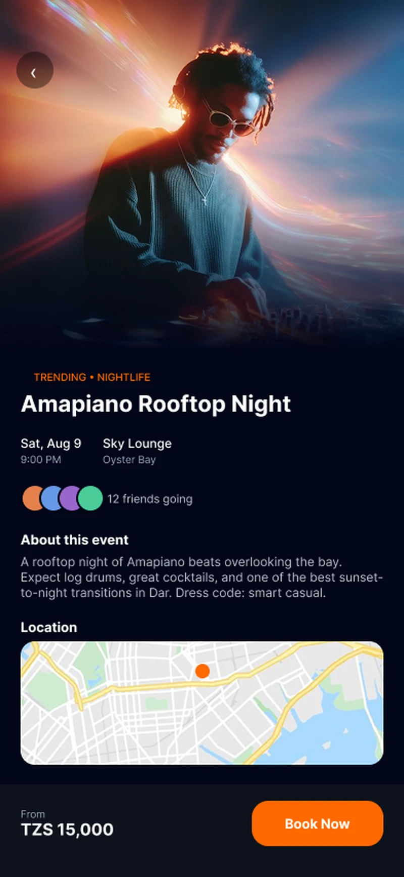
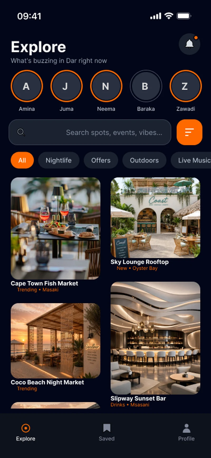
For visitors, Explore is a photo-first masonry grid with live signals like 'Trending' and '12 friends going', because social proof is what actually gets people out of the house. Every event shows the price in TZS and a Book Now button up front, so intent turns into a ticket in two taps. For venues, onboarding sells three outcomes (visibility, real-time stats, effortless event management) before asking for anything. The dashboard puts views, saves and check-ins first, listing stats break down the audience by age, and payouts land in M-Pesa. Seeing proof that Fyspo brings people in is what turns a free listing into a paying customer. The whole app is dark with a single orange accent, so it reads well at night and every call to action stands out.
Highlights
35
screens across two apps
Visitors discover, venues sell
TZS
Prices and payouts in local currency, paid out to M-Pesa
Next work
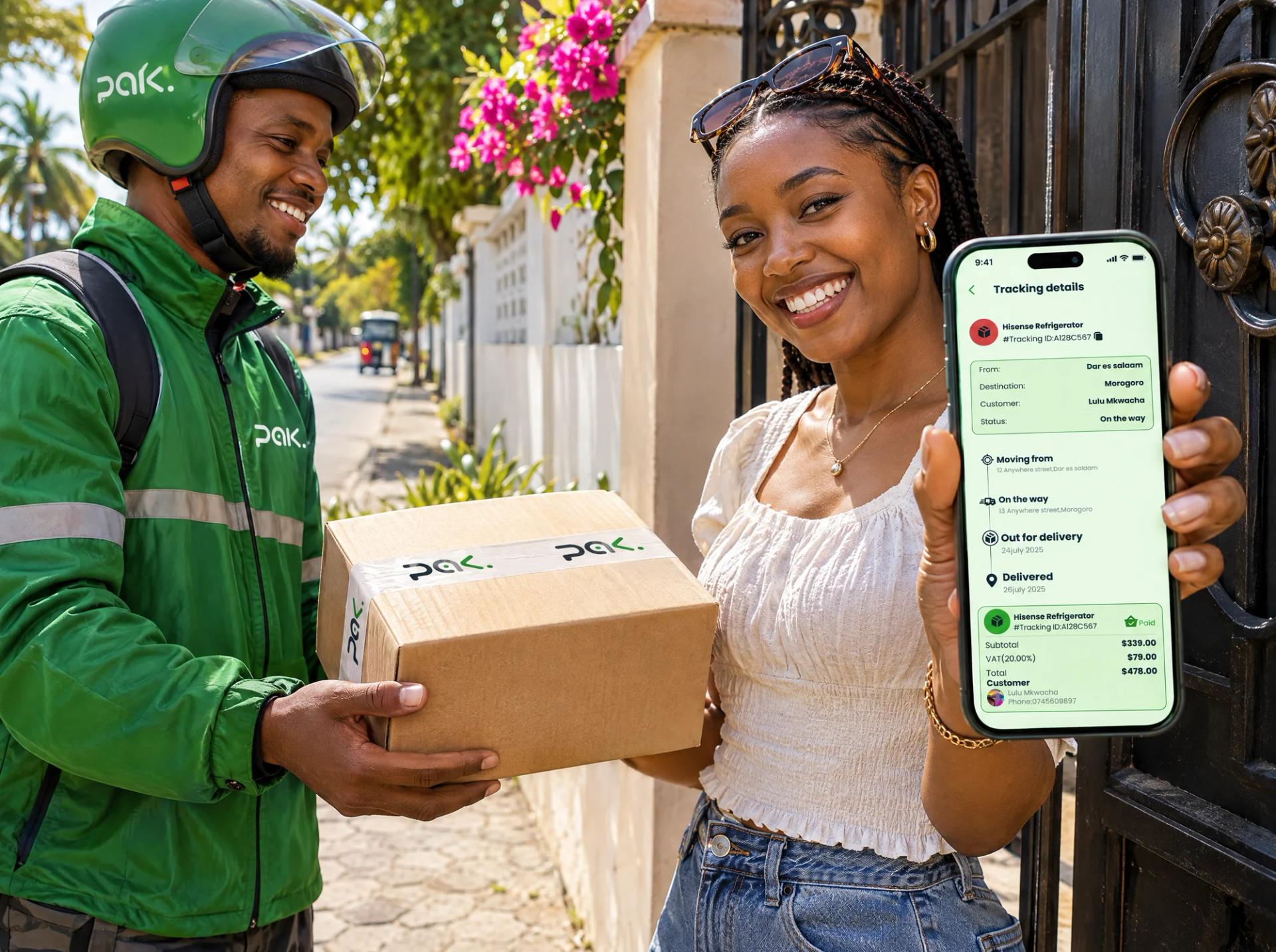
PAK